PROJECT:
Hadong Silk
SCOPE:
Branding / Brand Identity / Art Direction / Packaging / Copywriting / Illustration / Web Design & Development
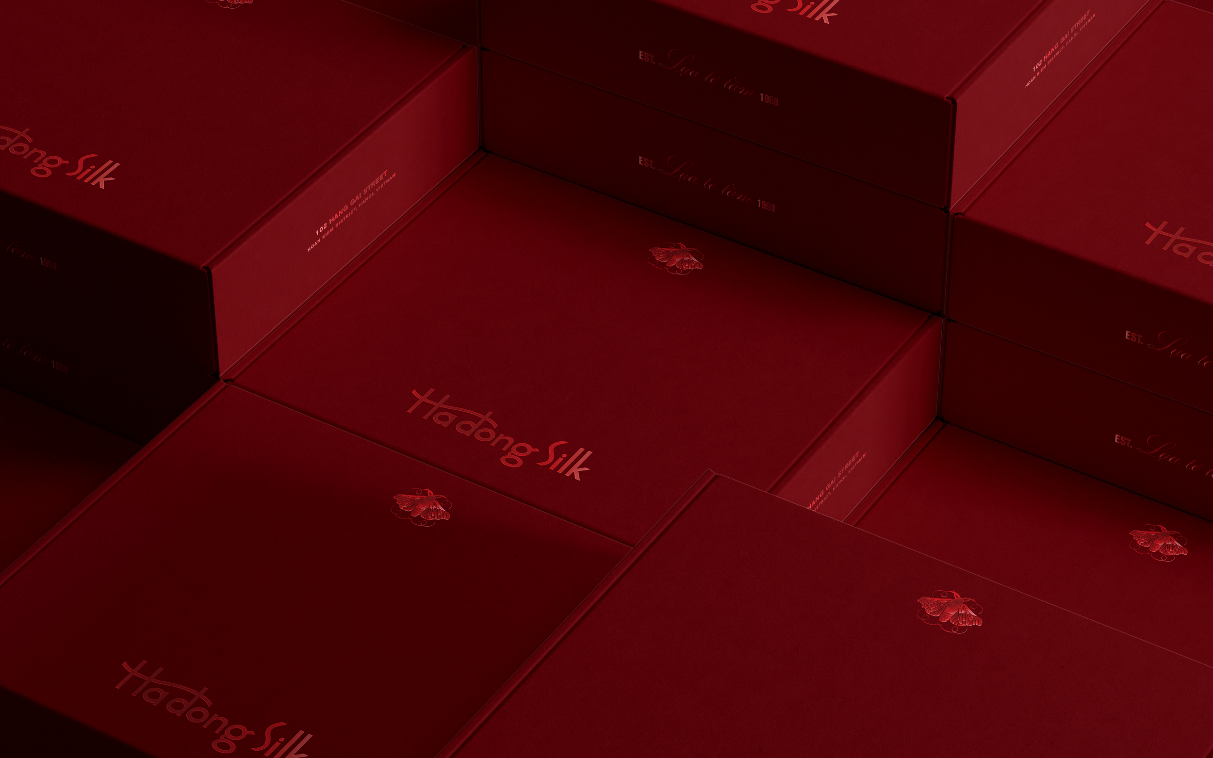
Hadong Silk is a family-owned silk shop with a history as illustrious as its clientele. Established in 1998 and located in the heart of Hanoi’s Old Quarter, the shop has been a favorite of locals, travelers, influential diplomats and VIPs gracing a visit from overseas. Driven by the love of preserving and sharing the art of silk in many different forms, the brand’s array of products is an excellent curation of premium apparel, fashion accessories, soft-to-touch fabrics and other cultural gems.


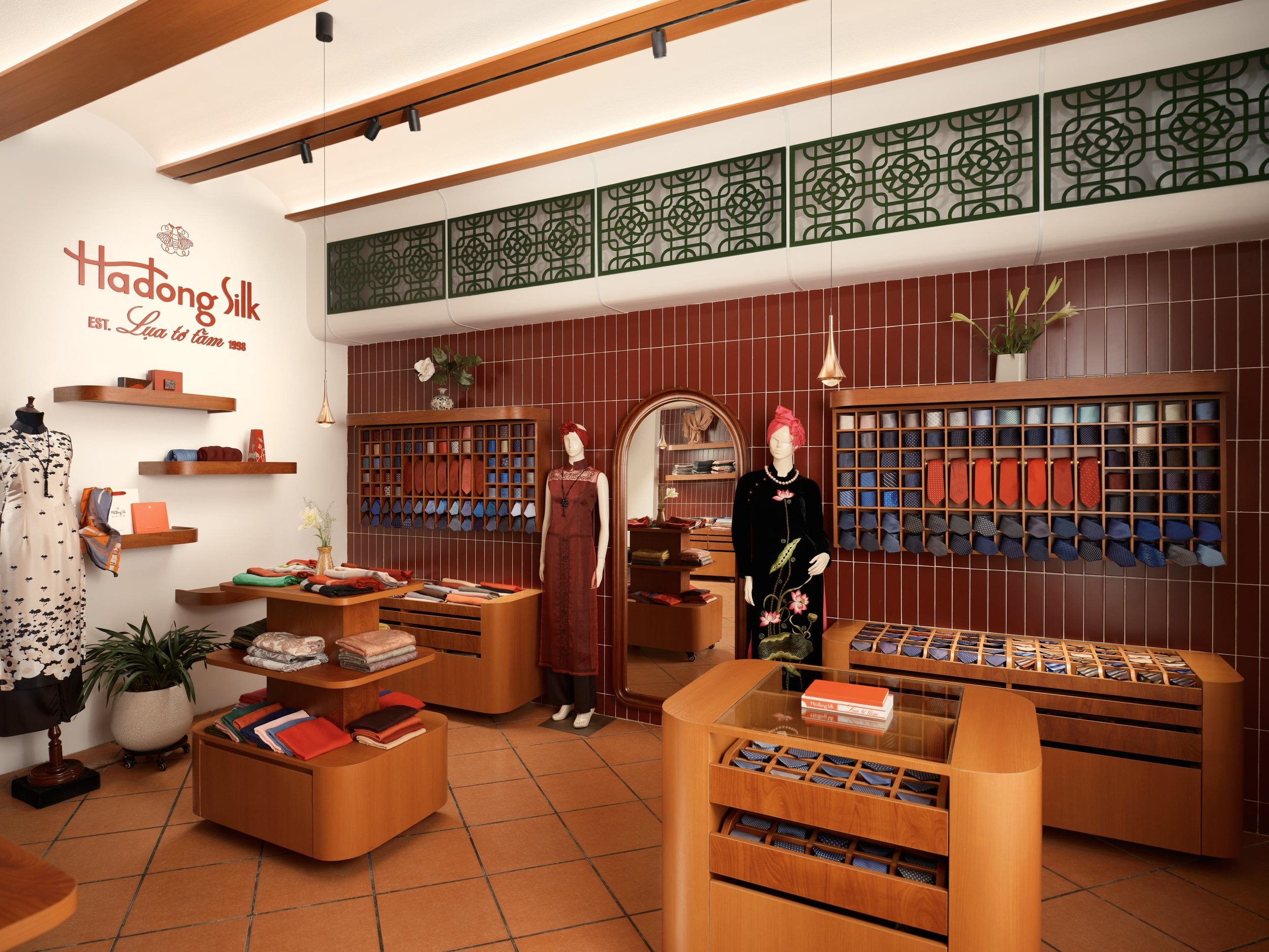
Much like how the time-tested craft of silk-weaving gets reinvigorated with new techniques and approaches, Hadong Silk’s new branding is a nod to the old and infused with the new. The transformation more aptly draws on the rich history of textiles and Vietnamese silk-weaving, showcasing their decades worth of knowledge and craftsmanship through cohesive and impactful branding.


The market is understandably very saturated with a dime a dozen competitors. We created an ownable visual system to set them apart, modernizing whilst maintaining the regal splendor of an established brand. An ode to the silk heritage shows up through visual elements inspired by the craft and culture.


Culturally, moths are symbols for positive transformation, rebirth and growth. The new icon parallels the brand story in the same way. The rebrand acknowledges the origins in the silkworm, and more importantly, the significance of transformation characterized through an elegant Silk Moth.
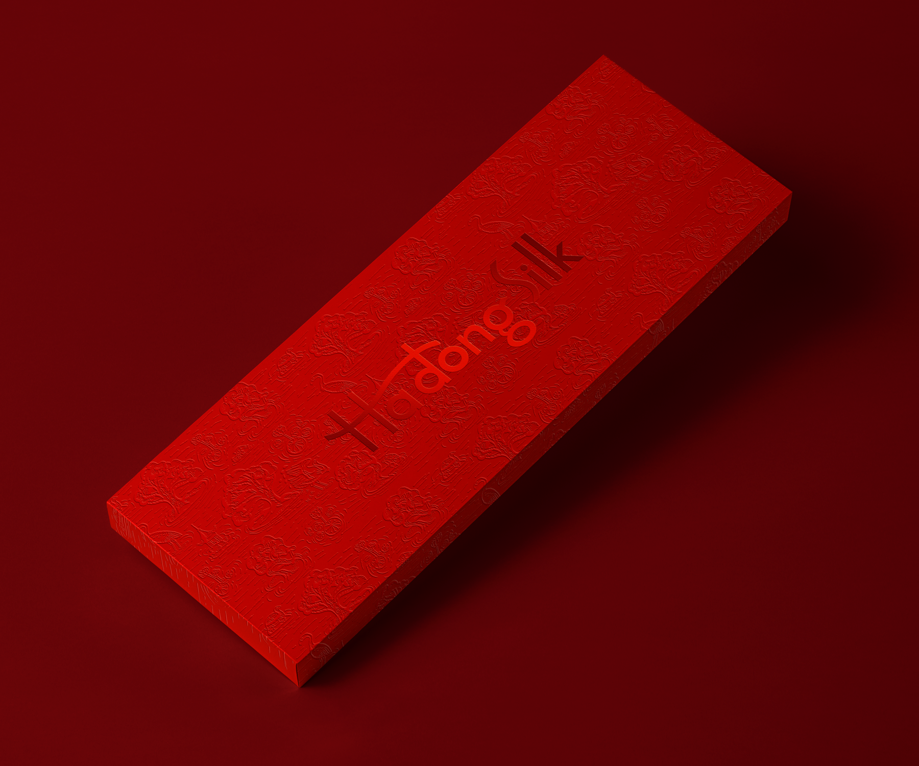
Red was the color of choice to create the association of brand that is steeped in Vietnamese tradition, but understands the power and intensity of a stronger, more vibrant shade to mark the start of something new.





Interior design: Dilog Studios
Photography: Khoi Ly Photography

